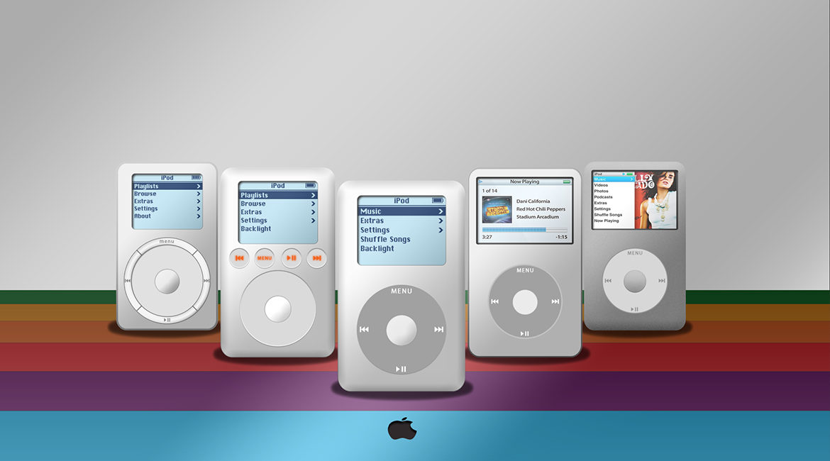
If you had tried to convince people that the most successful MP3 player would have fewer buttons and less functionality, not more, you would have been dismissed as a fool.
But the iPod proved the masses wrong. The iPod’s runaway success, was the first example of how Apple’s strikingly simple interfaces challenged the accepted norm of conventional product design in their markets. The click wheel came as a complete surprise to MP3 enthusiasts, and its simple perfection quickly established the iPod as the top player in the market.
Being an engineer, trying to do something perfectly often leads to doing it poorly or not at all. On the other hand, the conventional wisdom of “how-it’s-done” is sometimes just plain wrong. In today’s digital economy, you can almost make your applications more competitive simply by re-thinking and de-cluttering them. In many cases, the key is to do less, but do it better.
Minimum Viable Experience
Why do most early-stage products fail? It’s because they fail to build a truly compelling user experience. They don’t focus on a Minimum Viable Experience. If an interface looks familiar but doesn’t act like it is expected to, users might simply dismiss it as broken. It’s true. Unless your application is absolutely essential, users will give up on it if the experience is too complicated. There is a delicate balance between the simplicity of use and the complexity of usefulness. But it is true the product that is clear in its purpose, elegant in its execution and simple in its use will set itself apart from the competition and endear itself to the user.
John Maeda’s First Law of Simplicity states: The simplest way to achieve simplicity is through thoughtful reduction. Refinement that is thoughtful, calculated, and whenever possible and appropriate, based on data is one of the fundamental tools of any interaction designer. Remember, always thinking about the simplest way to do the most complex business is a great way to pave a path to success.


